|
What a conundrum! The internet is full of arguments over this question. Art books differ on the answer. Art teachers cannot agree on a definite solution. 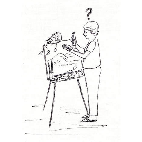 I recently spoke to one of my coaching, session participants about warm and cool colours - in particular, about the warm and cool split of the primary colours. The participant needed to buy paints and I suggested to start out with the three, split primaries plus white and a couple of earth colours. I explained the split primaries as a warm and a cool version of each primary colour - yellow, red and blue. The warm/cool split of red and yellow was easily explained. I then discussed the problematic conundrum of blue. Depending on who you listen to, ultramarine blue can be considered warm or cool. If we could purchase absolutely true neutral red, yellow and blue we wouldn't have this problem. Instead we have the choice to purchase a warm and/or cool of each primary because of inherent colour bias in formulated paint colours. When we consider that the yellow and red are warm colours and that blue is cool it is easy enough to define the warm and cool of red and yellow. If yellow moves towards blue (eg Lemon Yellow) it is considered a cool yellow and if it moves towards red (Cadmium Yellow) it is considered a warm yellow. If red moves towards blue (Alizarin Crimson) it becomes a cool red and if it moves towards yellow (Cadmium Red) it is a warm red. And then there is blue! Both yellow and red are warm colours and blue can only move towards yellow or red. Therefore, either direction can be considered to have a warming effect on blue. The question that is asked is "which direction is the warmest? " If this question can be answered then the opposing direction is the coolest in comparison. There are some arguments based on scientific explanations of the lengths of light waves emitted from the colours of the light spectrum. Find one of the arguments here. The colours of the light spectrum are often set out horizontally from red on the left to violet on the right (like a rainbow) in descending order of the lengths of their light waves - red, orange, yellow, green, blue, indigo, violet. The illustration below shows them set out vertically from violet to red. Violet has no relationship to red in this spectrum and is considered the coolest colour, therefore, any blue approaching violet is regarded as cool and any blue approaching yellow, towards the red, is considered warm. 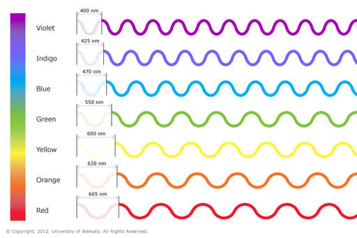 Colours and wave lengths of visible light spectrum - Image accessed from https://www.sciencelearn.org.nz/resources/47-colours-of-light So, why is red supposedly the warmest colour and violet the coolest on the visible, light colour spectrum? This is not supported by science. It is a psychological effect. Scientific studies have shown that objects emitting longer light waves (eg red) are cooler than those emitting shorter light waves (eg blue). Check this out here and here. We can also observe this phenomenon with a lit candle. The yellow part of the flame is cooler than the blue part of the flame near the wick. Using the visible, light colour spectrum to explain 'warm' and 'cool' colours is irrelevant. Another interesting study regarding blue being warm and red being cool is found here. The natural, visible light spectrum cannot be replicated in paint so we shall step away from this scientific explanation and come back to how each of us perceives colour. Now, we turn back to yellow and red. Which of these colours is the warmest? Here we find the basis for the dilemma with blue. People who see yellow as the warmest will generally view the greenish blues (cerulean, phthalo blue) as warmer than the reddish blues. People who see red as warmer will generally view reddish blues (ultramarine blue) as warmer than greenish blues. Those who consider yellow and red as equals and orange as the warmest colour may have mixed opinions on which blue is warmer. When you consider that a warm yellow is one that moves towards red and a warm red is one that moves towards yellow, there is strong argument for the midpoint between red and yellow to be the warmest colour and that colour is orange. Even deciding which colour advances and which recedes doesn't solve the conundrum. Again, people interpret the depth portrayed by colours differently. Check out this study. There is a common understanding that warm colours advance and cool colours recede. This common understanding doesn't lead to consensus on which colour is warm or cool when we cannot agree on which colours advance and recede. Do you use hints of red or do you prefer yellow to bring the foreground forward? We almost all use blue to push the background back but which blue do you choose for the most distant parts? Which blue do you see as the coolest? Do you know what? It doesn't really matter. The tonal qualities and varying saturations of colour in your painting will speak more about distance and depth than how you make the decisions on warm or cool. As long as you create interest by having variations of warm and cool within colour families (eg the blue family) and/or some opposing warmth or coolness to the dominant temperature (a touch of red, yellow or orange in a mainly blue hued painting or vice versa) it won't matter which colours you personally see as warm or cool. You can only paint from your viewpoint. You do not see the world through anyone else's eyes - only your eyes. How you see and define colour is personal to you. Paint what you see, how you see it. Leave the argument over the relative warmth or coolness of colours to the academics. The only thing you need to concern yourself with is the mixing of colours, especially when using a limited, split, primary colour palette. Instead of thinking in warm and cool biases think in terms of bluish reds mixed with reddish blues to make strong purples - greenish yellows mixed with greenish blues for rich greens - reddish yellows mixed with yellowish reds for rich oranges (secondary and tertiary colours). Then test other, two colour combinations for subtle or subdued colours (eg ultramarine blue with lemon yellow). The next step is to test three colour mixtures (red + yellow + blue or the complements such as green and red, orange and blue, yellow and purple) to get de-saturated colours, greys and earthy colours. Also test the effect of adding white to your colour mixtures. 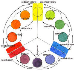 Split, primary colour wheel showing secondary and tertiary colour mixing. Original image of colour wheel accessed from http://www.nitaleland.com/articles/split.htm - an article worth checking out. As you expand your colour mixing knowledge you will further develop your ideas about which colours recede and which advance when placed next to other colours and also which colours you connect with on an emotional level. This knowledge is more important to advancing your painting skills than trying to conform to some commonly held and conflicting beliefs of warm and cool colours. Your warm may be my cool and vice versa, but who cares? It is irrelevant. You define how you use colours and I will define my use of colours. There are more important considerations to making a painting work. Many beautiful, intriguing paintings/drawings are black, white and neutral grey tones. Warm and cool colours have nothing to do with their success. Distance, depth, aerial perspective, advancing foregrounds, receding backgrounds can all be achieved with tone, form and line - whether in grey toned or coloured artwork. Forget about the whole warm/cool colours conundrum. 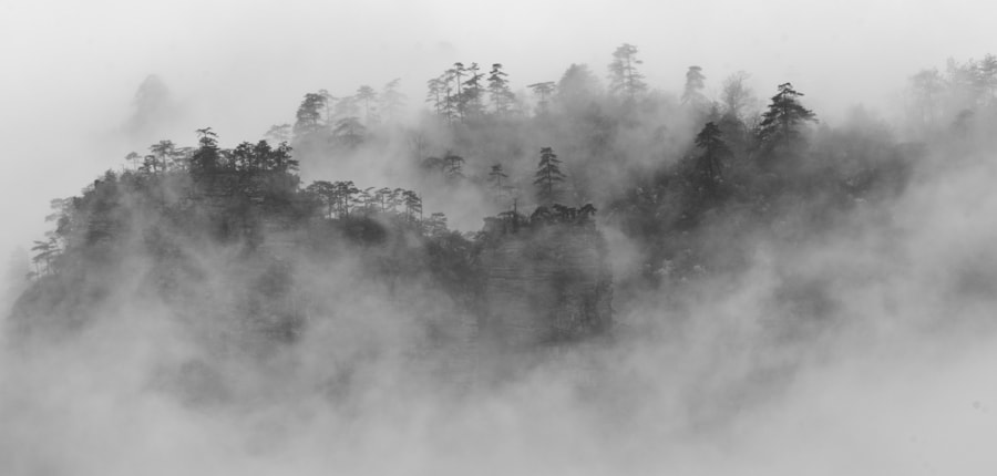 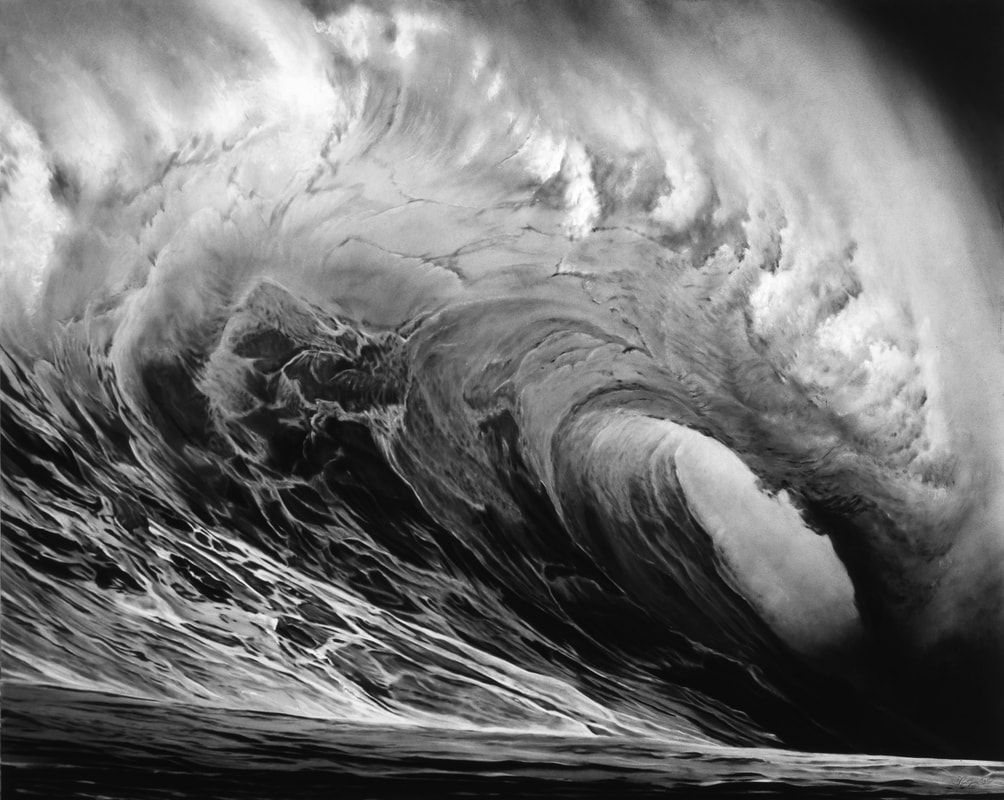 Lydia Goetze, Zhangziajie, China, 2012 Robert Longo, Untitled (Crown of Thorns), 2012, Accessed from The Luminous Landscape charcoal on mounted paper, 70 x 88 inches Accessed from Robert Longo Until next time, Anne.  Psst: Don't forget to sign up for my newsletter - in the footer below.
Joel J
25/4/2022 01:16:21 pm
Thank you - I find your writings on this subject VERY helpful! So it's not me - it just is confusing.
Anne Huth
25/4/2022 04:57:38 pm
Thank you. Comments are closed.
|